The following works are either isolated from larger series or purely of historical import.
Les œuvres ci-dessous sont soit isolées soit plus anciennes.
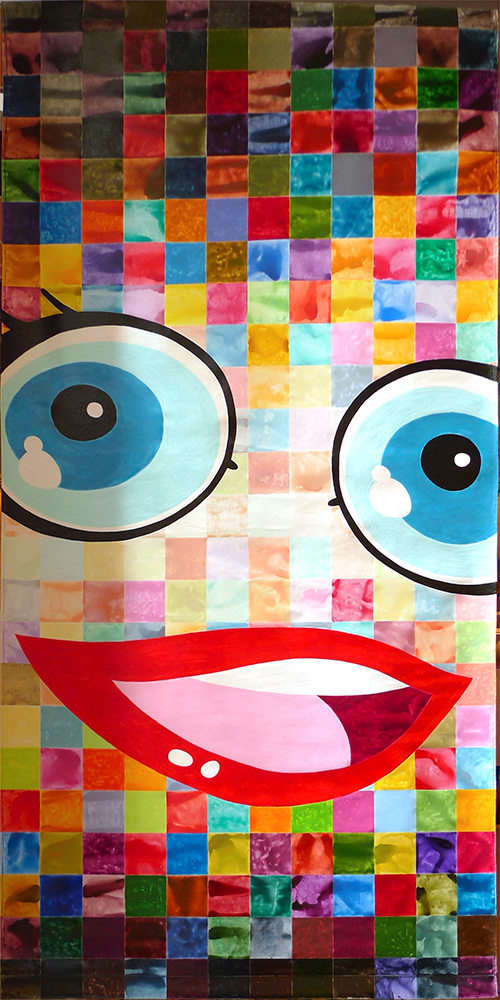
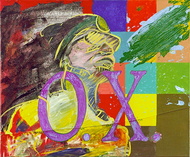
4 STUDIES AFTER ROBERT MAPPLETHORPE’S "MAN IN POLYESTER SUIT" (1980) : THE 4TH PAINTING
1996-1999, acrylics on canvas and digital print on dibond, 2 * 154 x 120 cm
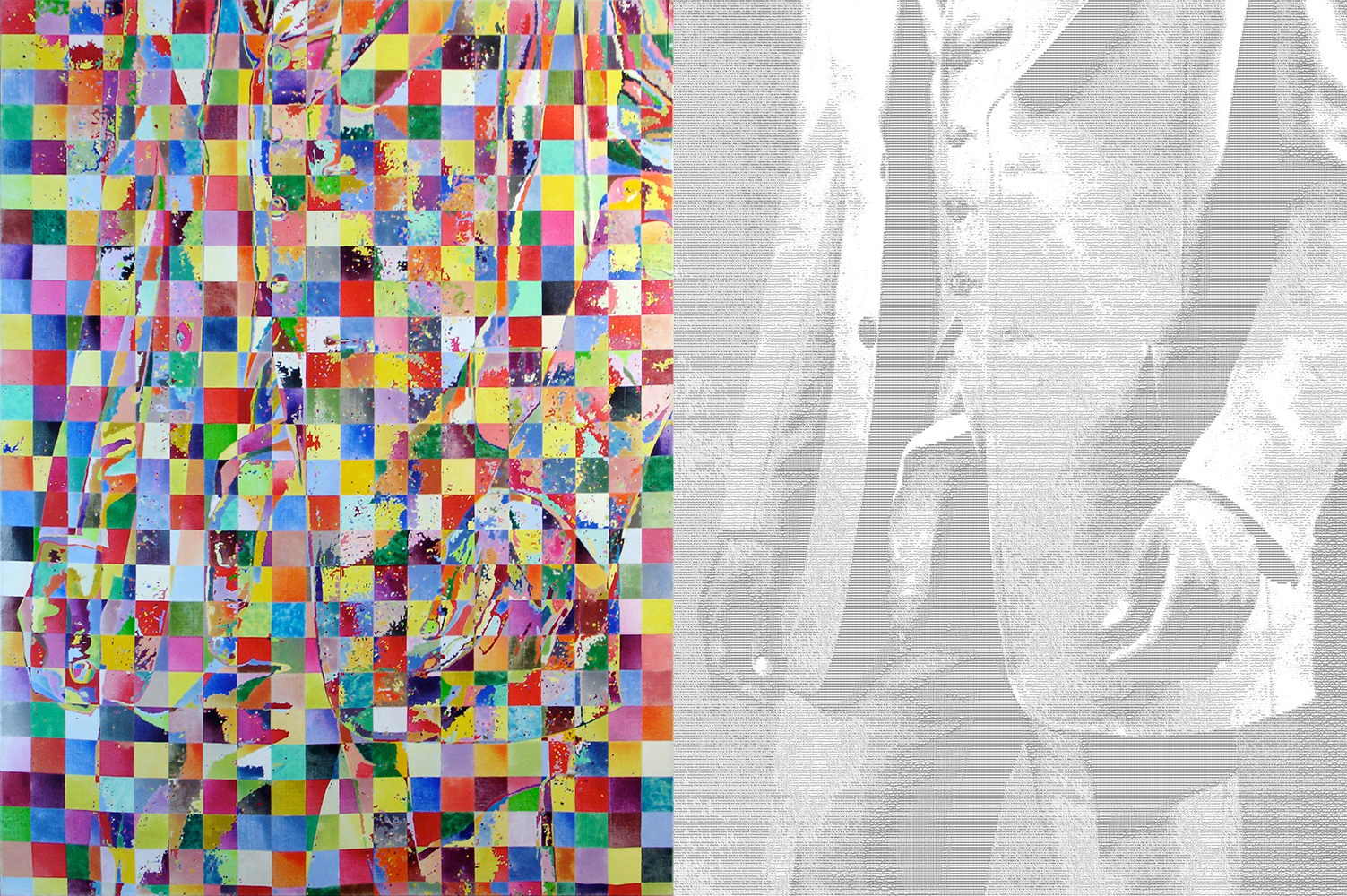
“4 studies after Robert Mapplethorpe’s ‘Man in polyester suit’ (80) : the fourth painting” (a mouthful, I know), is a direct reference to a previous quadriptych that I had left uncompleted purposefully (see below), to convey the idea that the death of the great photographer Mapplethorpe had been premature.
It uses the same principle as one of those 3 early paintings, but on a much bigger, more ambitious scale. I used Photoshop to posterize (reduce to a given number of shades of gray) a scan of the original photograph, and gridified the result : drawing that reproduction on the canvas led to around 20,000 zones.
Painting them in vivid colors, while trying to maintain a high contrast between adjacent zones, led to an almost illegible image, although it is actually quite faithful. The image on the right, on the other hand, is a purely digital process, a conversion of the same scan to ascii-art (a combination of characters). In a way, it has nothing to do with the original photograph, yet, it is quite clear and recognizable from a short distance, whereas the painting requires more attention, perhaps some squinting, and to stand pretty far back before you’re able to see its shapes.
Le titre évoque le rattachement de cette oeuvre à un quadriptyque laissé à l’origine volontairement inachevé (voir ci-dessous), de façon à évoquer la fin prématurée du grand photographe Robert Mapplethorpe. Mais en réalité, c’est un leurre, puisqu’il s’agit d’un diptyque parfaitement autonome.
La peinture reprend le principe d’une des trois toiles initiales, mais à une échelle largement supérieure, à tous points de vue : la photo de Mapplethorpe a subi une isohélie afin de la réduire à un nombre restreint de niveaux de gris, qui permettent de la délimiter en aplats. Cette isohélie est complétée par un découpage en carreaux de 6 cm de côté.
Toutes les zones ainsi définies (délimitées par les bords des aplats de l’isohélie et ceux du quadrillage) sont remplies d’une couleur distincte.
Le pendant infographique, réalisé via un logiciel d’« ascii-art », et composé uniquement de lettres, signes et chiffres, permet de jouer sur le contraste entre le noir et blanc et la couleur, et de s’interroger sur les questions de lisibilité : si on s’éloigne un peu, la partie imprimée, qui n’a, du point de vue des formes qui la composent, strictement rien à voir avec la photo originelle, est évidente, alors que la peinture reste globalement impénétrable, bien qu’elle soit en fait fidèle à l’image dont elle s’inspire.
4 STUDIES AFTER ROBERT MAPPLETHORPE’S "MAN IN POLYESTER SUIT" (1980)
1990-1991, lacquer and cockroaches on canvas, 43 x 65, 43 x 38 and 43 x 38 cm
RAIN ON A PARADE OF LOW EXPECTATIONS
2009, acrylics on canvas, 4 * 130 x 130 cm
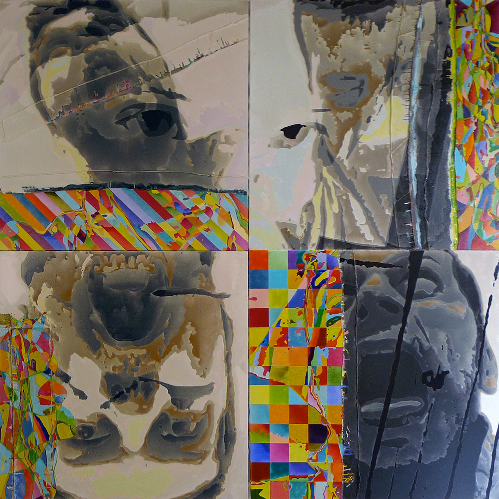
"Rain on a parade of low expectations" follows in the footsteps of a banner I had created for « L’art et la bannière », a summer exhibition in the town of Prayssac somewhere in the south of France.
This gave me a starting point for more serious work, starting with these 4 self-portraits, and would later continue with the series of portraits of writers. The technique remains basically the same, with the exception that each painting handles the “abstract/colorful” portion differently.
There are also two ways to present the work : either as a series of four standalone paintings, or as a quadriptych. In this last case, the third painting, at bottom left, must be presented upside down, and a fifth portrait can be perceived, superimposed over the 4 faces.
Dans le prolongement du travail pour « L’art et la bannière », j’ai décidé de poursuivre dans la veine des autoportraits grimaçants, limite grand-guignol, en conservant le principe d’une partie peinte en « mode abstrait » (juxtaposition de zones de couleurs vives et fortement contrastées), et le reste traité de façon relativement naturelle, du moins en conservant à peu près les bonnes valeurs de luminosité.
Les quatre toiles peuvent être prises séparément, ou bien montées ensemble selon un carré de 2m60 de côté, l’une d’entre elles étant alors disposée à l’envers, tête en bas.
Ces 4 toiles ont eu plusieurs noms (Autoportraits, Abymes), avant que je ne me décide pour « Rain on a parade of low expectations »
ENTROPIE / BOHEEMIELÄMÄÄ / ENTROPIE #4 : JANUS IN FLOWERS / PROPELLERGIRL AU MUSÉE D’ART MODERNE
2009 / 2012 / 2013 / 2013, acrylics on canvas, 4 * 240 x 120 cm
These 4 banners were created for the towns of Prayssac and Thiers, to be exhibited outside on the walls of the cities during the summer. Themes were, from left to right: "Seen from the window", "Bohemian lifestyle", "Artist and freedom" and "Joy material".
Ces 4 bannières ont été créées à la demande des villes de Prayssac et Thiers, qui les ont accrochées aux murs de la ville pendant des expositions collectives durant l'été. Les thèmes imposés étaient, de gauche à droite : « Vu de la fenêtre », « La Bohème », « Artiste et liberté » and « mathiers à joie ».
REPENTIR
2006, acrylics on canvas, 2 * 97 x 130 cm
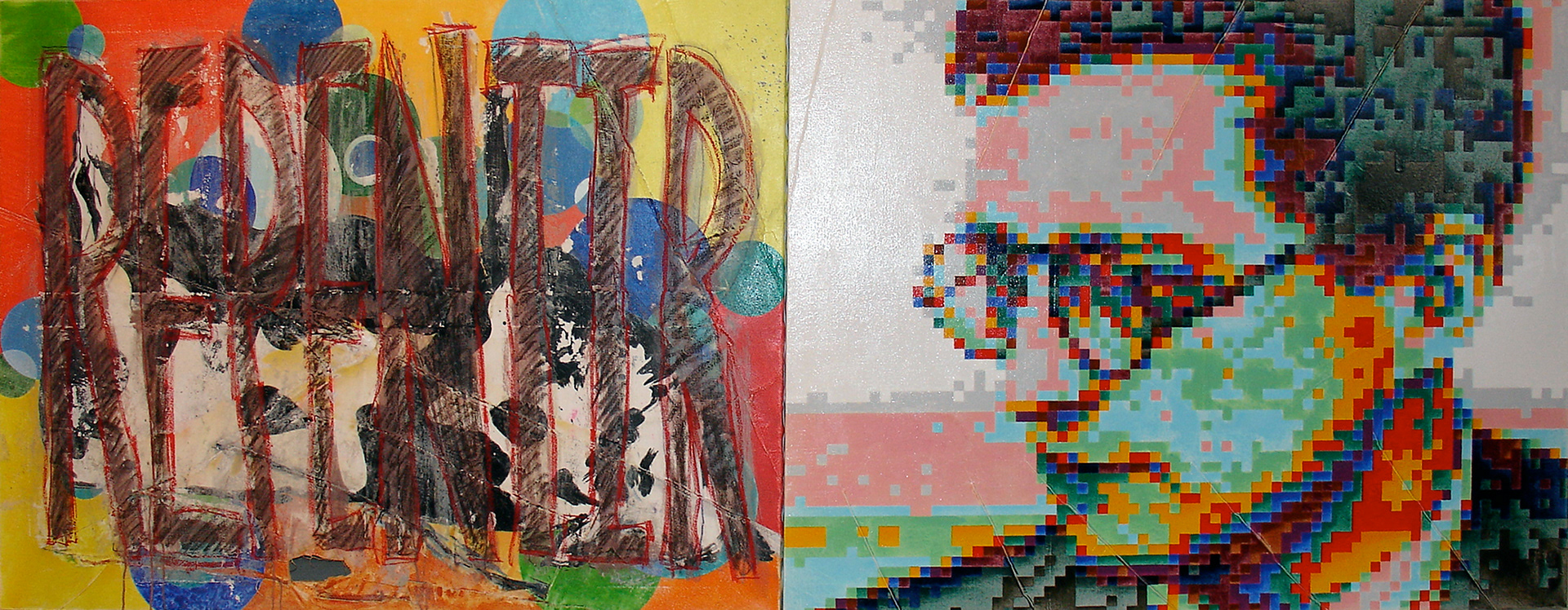
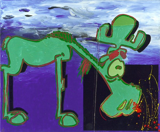
This actually started out differently; I wanted to paint a series of animals, each one paired with a photograph of a woman taken by a different photographer. The first painting was of a cow, which was to be followed by a large Tuna fish.
However, I didn’t like that cow I had painted. It was a lame cow, a lame painting, and I really wasn’t that interested in the whole thing anymore. So I gave up on that project altogether. But what would I do with that cow painting ? Recycling has always played an important part in my work, and I tend not to throw much away.
I decided to turn it upside down, splash some paint thinner on it, scratch it, and savagely sand it. Over what was left, I drew a large word, "Repentir" (a pentimento in French), because that’s what it had become, after all.
"Repentir" is also a verb in French, and it means to repent. So I created a second painting, a portrait of the composer Shostakovich, well known for [reportedly] saying his symphony was “a Soviet artist’s creative response to justified criticism". And this what I got.
Cette œuvre a commencé différemment ; je voulais faire des peintures de quelques animaux, accompagnées chacune d’une photographie de femme, photos que j’aurai demandées à des photographes différents. Les premières toiles devaient être un vache, que je fis, et un poisson, dont je commençai le dessin.
Et puis ça ne m’a pas plu. Cette vache ne m’intéressait pas tant que ça. Et j’ai abandonné tout le projet, avec l’idée de tout saccager. La vache s’est retrouvée tête en bas, aspergée de décapant, griffée, grattée, et sauvagement poncée. Sur les restes, j’ai griffonné le mot repentir, puisque c’est bien de cela qu’il s’agit (pour ceux qui l’ignoreraient, la notion de repentir, en peinture, consiste à repeindre différemment sur une œuvre dont on n'était pas satisfait, pour tout ou partie).
Et dans le même temps j’ai utilisée l’autre toile pour un portrait de Shostakovich, connu entre autres choses pour avoir sous-titré sa cinquième symphonie « Réponse d’un artiste soviétique à une juste critique ».
Je suppose qu’il est inutile d’en dire davantage.
WEAK CONCEPTS
1996-1998, acrylics and lacquer on canvas, 2 * 97 x 130 cm
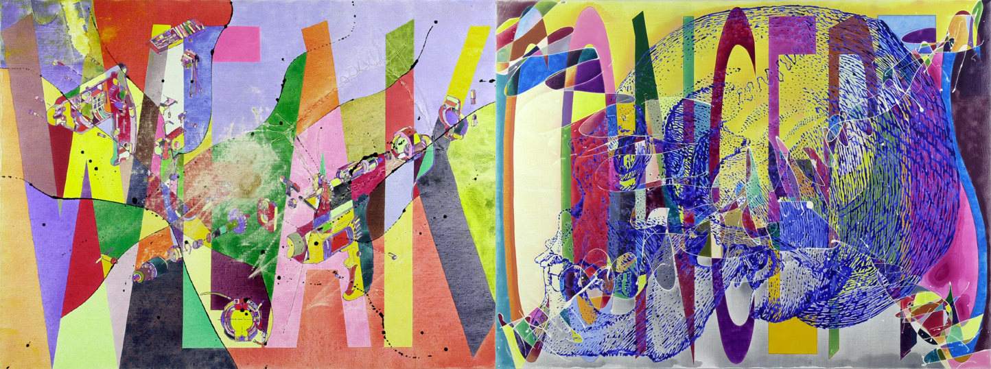
Although the paintings I make use very little actual paint, it's always a work on layers. Here we find the customary layers (background, dripping, drawing, lettering, meaning) plus a new one that comes through the partial erasing of the finished painting with a sander disc attached to the actual drill that is represented on the painting itself.
The concept is a kind of mise-en-abyme of conceptual art: it is both formalized by a representation and physically weakened by its own object.
C'est un travail particulièrement symptomatique de ma technique de couches. Ici, outre les couches normales (fond, dripping, dessin, lettrage, signifié), s’en trouve une supplémentaire qui consiste à effacer partiellement la toile achevée avec la ponceuse qui est représentée en éclaté sur la première toile.
Le concept, puisque c’est de ça qu’il s’agit, consiste donc en une mise en abyme de l’art conceptuel, en le formalisant (retour à de l’art plastique) puis en l’affaiblissant (perte de matière, ajout de sens.)
STICKS AND STONES / STICKS AND STONES (FEMALE)
1995-1996, acrylics on canvas, 2 * 4 * 73 x 81 cm
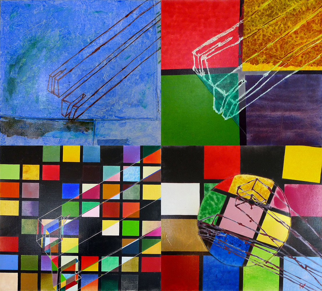
This work is mostly abstract. The same stretcher frame mortise end is shown twice (viewed from the back and from the front) 4 times : once with the two views next to one another, once slightly apart, and again but in a 3D-like mode where all edges are visible.
The number of colors used in the background is multiplied by 4 with each painting : first one color, then 4, then 16, and finally 64 (that is 4 to the power of, respectively, 0, 1, 2 and 3, for the mathematically inclined).
This is done twice, first with a representation of the male end of the mortise, and once with the female extremity. Those 2 quadriptychs are conceived as a kind of mirror of one another and are in fact supposed to be shown back to back.
C’est principalement un travail abstrait (4 fois la même mortaise de châssis, vue de deux côtés opposés, en les accolant ou non, faces cachées visibles ou non, et en multipliant par 4 le nombre de faux carrés qui constituent le fond de chaque toile).
Le choix pour une face d’une extrémité mâle de mortaise, et pour l’autre de l’extrémité femelle, en les renvoyant dos à dos plus quelques autres détails, n’est pas non plus innocent.
A TOOLKIT FOR SURVIVAL
1991-1992, acrylics and lacquer on canvas, 12 * 60 x 73 cm
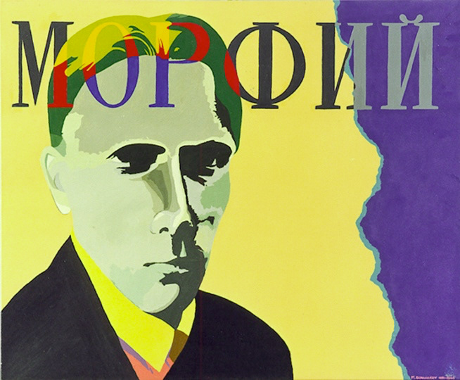
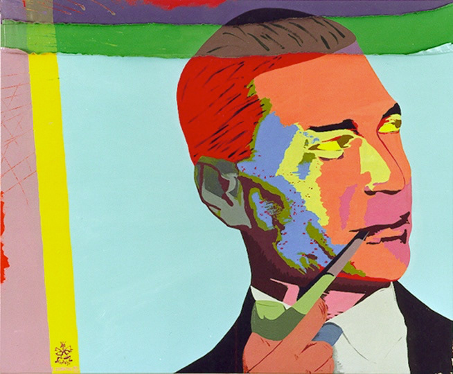
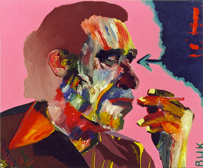
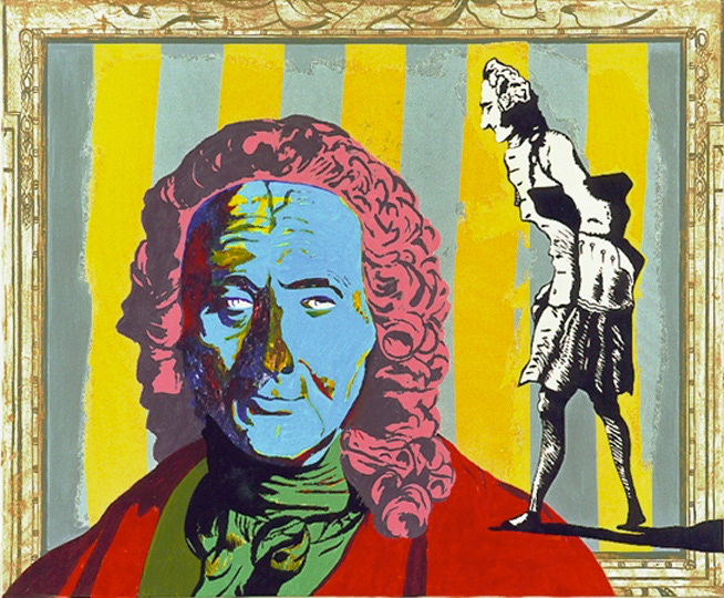
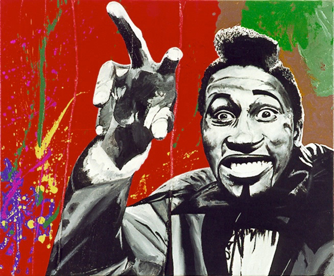
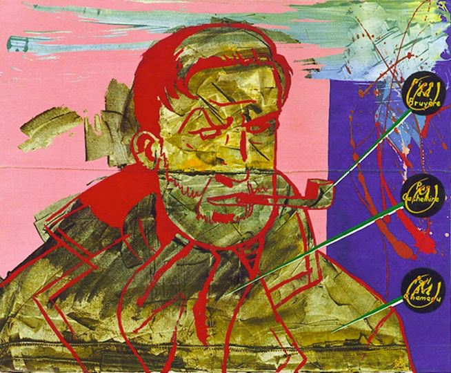
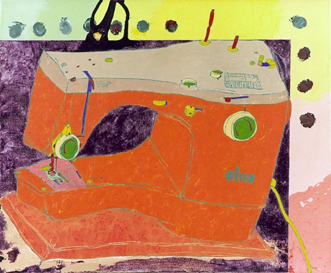
On the classic idea of "what you would take with you on a deserted island", I wanted to create a series of simple homages. It started with 3 writers and then went on with 3 comics , 3 musicians. It stopped at 3 machines (that think) but it could have gone on, for example with 3 houseplants. It didn’t, but it could have.
Each painting uses a different technique.
They are:
- Yevgeny Zamyatin, Charles Bukowski & Mikhaïl Boulgakov for the writers ;
- Jojo (by Geerts), l’Élan (by Frank Pé) and Edgar P. Jacobs’ Mortimer for the comics ;
- Ice T, Rameau & Screamin’ Jay Hawkins (from a photograph by Brian Smith) for the musicians ;
- Macintosh SE/30, Elna T/SP & Naim Nait 2 for the machines.
Réparties en quatre séries de trois toiles (3 écrivains, 3 bédés, 3 musiciens, 3 machines), ces toiles se veulent de simples hommages au premier degré, un peu dans l’esprit de « ce qu’on emporterait sur une île déserte ».
Chaque toile est traitée de façon différente, entre pop-art et hyperréalisme.
Dans l’ordre, il s’agit de :
- Evguéni Zamiatine, Charles Bukowski et Mikhaïl Boulgakov pour les écrivains ;
- Jojo (de Geerts), l’Élan (de Frank Pé) et le professeur Mortimer d’Edgar P. Jacobs pour les bandes dessinées ;
- Ice T, Rameau et Screamin’ Jay Hawkins (d’après une photographie de Brian Smith) pour les musiciens ;
- Macintosh SE/30, Elna T/SP et Naim Nait 2 pour les machines.
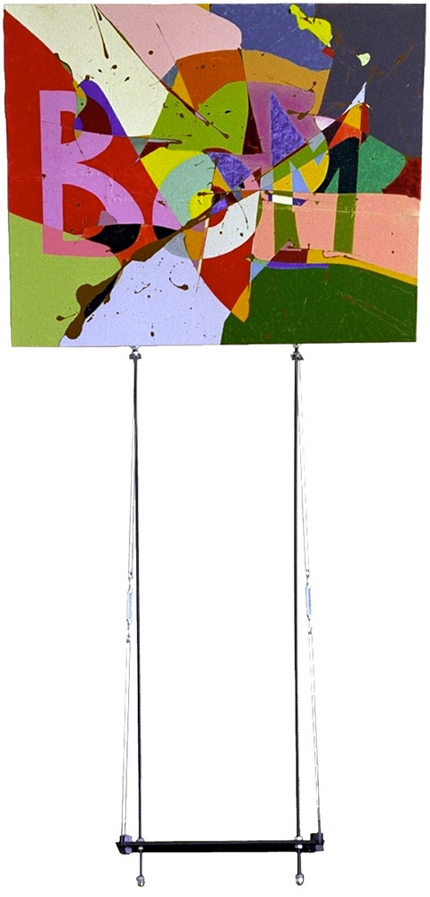
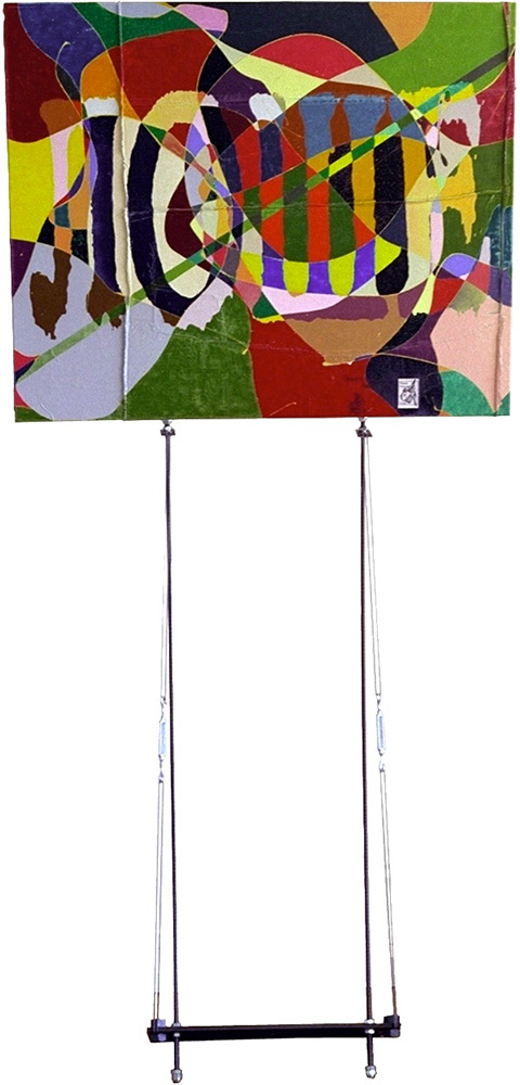
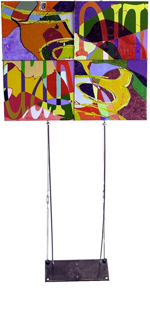
L'ENVERS VAUT L'ENDROIT
1995, acrylics and lacquer on canvas, steel, 3 * 81 x 100 cm and steel stands of 100 x 20 cm
Portuguese - front
Serbian - front
Norwegian - front
Portuguese - back
Serbian - back
Norwegian - back
On each of these 3 paintings are written the words "good" and "bad" in 3 different languages.
First, there is Portuguese : "Bom" (good) is on the good side of the canvas, while "Mau" (wrong) is on the back, behind the stretcher.
Next comes Serbian. Here, Dobro & Loche, written in cyrillic characters, are exchanged and crossed. Good is in the back, bad in the front.
Finally, the Norwegian words, God and Dårlig, were painted on both sides of the canvas without stretching it. Then the canvas was cut in 4 rectangles and shuffled in both directions, sewed back together and finally stretched.
Altogether, it can be viewed as a vision of Europe, a Manichaean one, where south is simple and straightforward, east is the evil of war, and north is the confusion of modern civilization.
They can be shown in any way.
Sur chacune des 3 toiles on trouve les deux mots « bon » et « mauvais » écrits dans 3 langues différentes.
D’abord en portugais , où le mot « Bom » est sur le « bon » côté de la toile (autrement dit, sa face avant) et le mot « Mau » évidemment à l’arrière, côté châssis.
Puis en serbe, où les mots (Dobro et Loche, écrits en cyrillique) sont inversés et rayés.
Enfin en norvégien, où les deux mots (God et Dårlig) ont été peints de chaque côté de la toile non tendue, avant de la découper en quatre parties égales, de la recoudre en mélangeant les morceaux et de la tendre sur le châssis.
Il s’agit d’une progression européenne, d’une vision manichéenne où le sud représente la simplicité, l’est l’horreur de la guerre et le nord la confusion de la civilisation occidentale.
On peut les disposer librement.
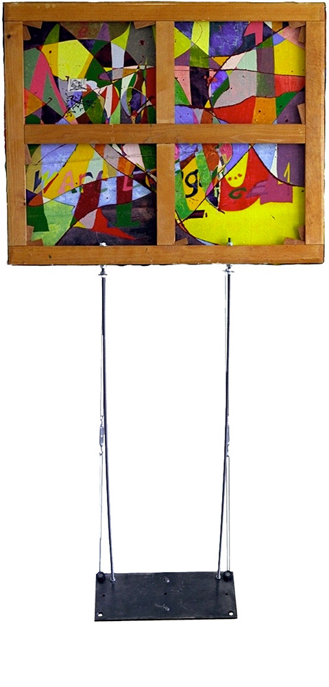
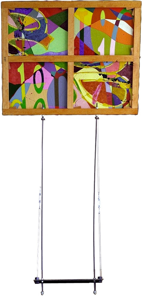
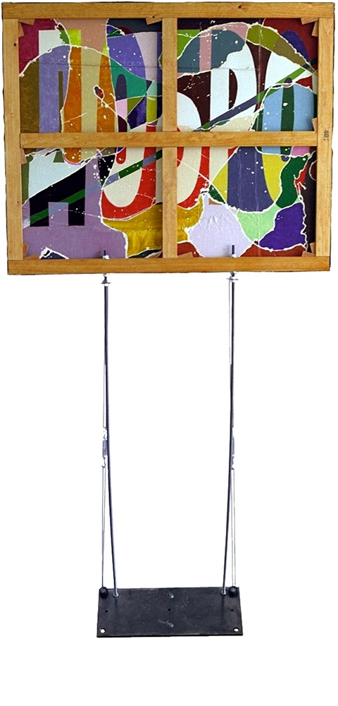
PAYSAGE SOUS SURVEILLANCE #1-3, #10, #11-13
1991-1992, acrylics and lacquer on canvas, 3 * 40 x 40 cm, 97 x 130 cm, 3 * 97 x 130 cm
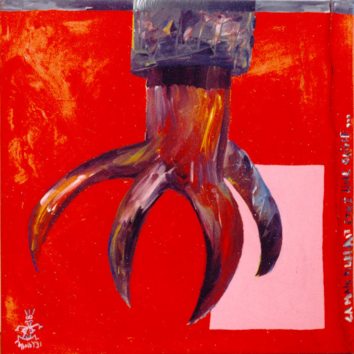
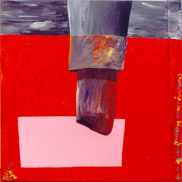
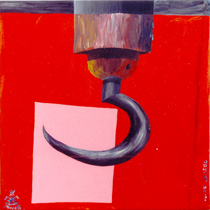
This series of paintings is based on the eponymous text of East-German playwright Heiner Müller. It is a description of an image (photograph or painting), with a series of suggestions regarding what is just off-frame, or what may have occurred in the immediate past.
It was a text with an acutely visual quality, and I thought it would be interesting to use a mise-en-abyme with it, to create new images an new extrapolations from his images and extrapolations.
The 3 first paintings, on small canvasses, are really mere illustrations of an excerpt of the text : "La main pourrait être une griffe, un moignon (peut-être couvert d’une croûte), ou un croc." (The hand could be a claw, a stump (perhaps covered with a scab), or a hook.)
Paintings #4 to #9 have been abolished. They have not been physically destroyed, although they have been heavily tinkered with in some cases, but I think they are bad enough to warrant a ban from my portfolio.
Cette série de toiles est inspirée du texte « théâtral » autant qu’éponyme de Heiner Müller. Le dramaturge est-allemand décrit une image dont on ne sait au juste s’il s’agit d’une peinture ou d’une photo, en supputant les choses et les événements hors cadre.
Comme il s’agit d’un texte très visuel, je trouvais intéressant de le mettre en abyme, en réinterprétant ses images et idées en de nouvelles matérialisations, qui peuvent à nouveau engendrer des textes, et ainsi de suite...
Les trois premières toiles, de petites dimensions, sont assez littéralement calquées sur un bref extrait du texte : « La main pourrait être une griffe, un moignon (peut-être couvert d’une croûte), ou un croc. »
Les toiles 4 à 9 ont été bannies.
4 MOUCHES TSÉ-TSÉ
1987-1988, acrylics and lacquer on canvas and leather, 4 * 35 x 27 cm
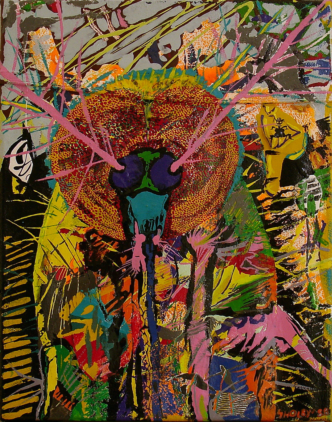
Each of us has to start somewhere, I suppose. And for me this is the start, the tipping point. Before these, I already painted a lot, but it was on my gloomy furniture, or on small sheets of paper.
With these 4 small frames onto which I nailed recycled materials (pieces of old blue jeans or leather), I embarked on a journey without return.
The title refers to tsetse flies, but in fact I used a macrography of a mosquito found in an issue of Libération, a French daily newspaper.
I find these 4 paintings fairly interesting, because they already contain elements that are still prominent in my work today: very vivid colors, working with tiny areas of paint and small brushes, never covering paint with more paint, and working on multiptychs.
Il s’agit de mes toutes premières peintures sur toile. En fait de mouches tsé-tsé, j’étais parti d’une macrophotographie de tête de moustique trouvée dans un article de Libé.
Dans ces premiers essais on trouve déjà des éléments qui ont perduré dans mon travail : une certaine minutie, l'utilisation de couleurs vives, l'idée de ne jamais recouvrir de la peinture avec de la peinture, et le travail en polyptyques.
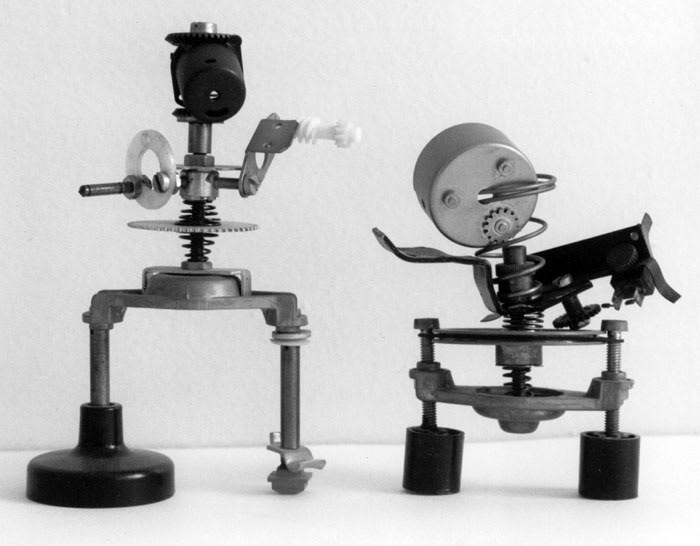
SCULPTURE: PETITS ROBOTS
1988, 1988, 1991, metals and plastics, 10 x 8 cm, 12 x 8 cm, 14 x 13 cm
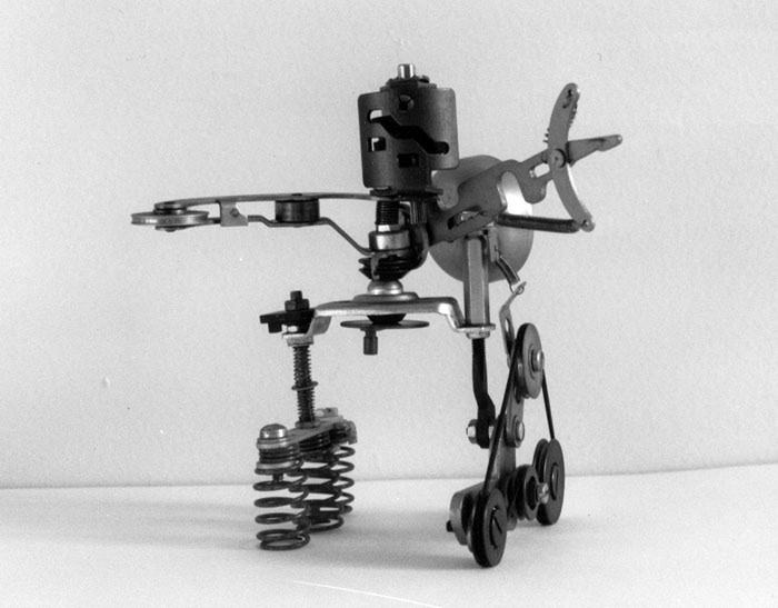
SCULPTURE: GRANDS ROBOTS
1989, 1991, 1992, 1992, metals and plastics, 34 x 20 cm, 25 x 20 cm, 43 x 30 x 8 cm, 39 x 18 x 24 cm
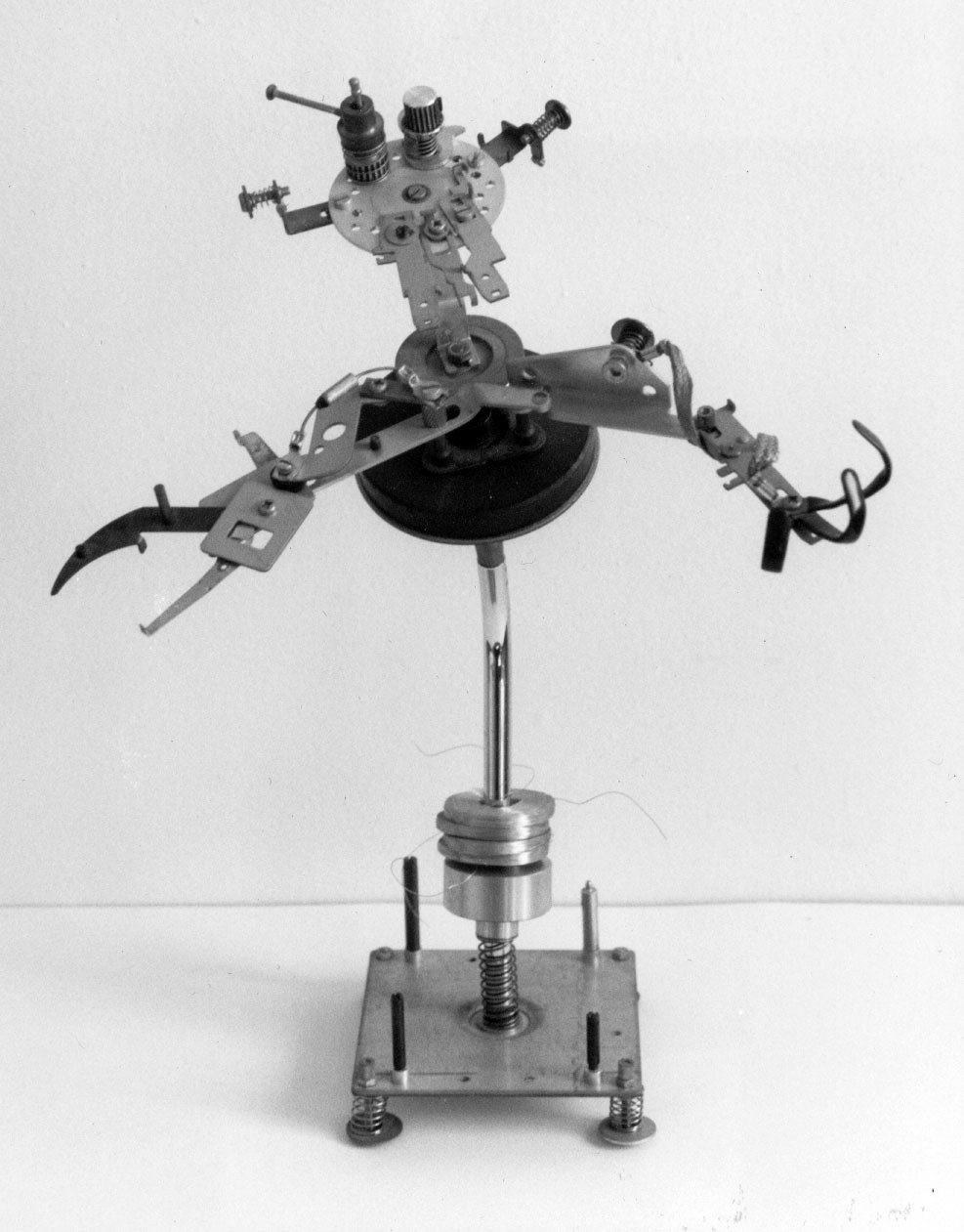
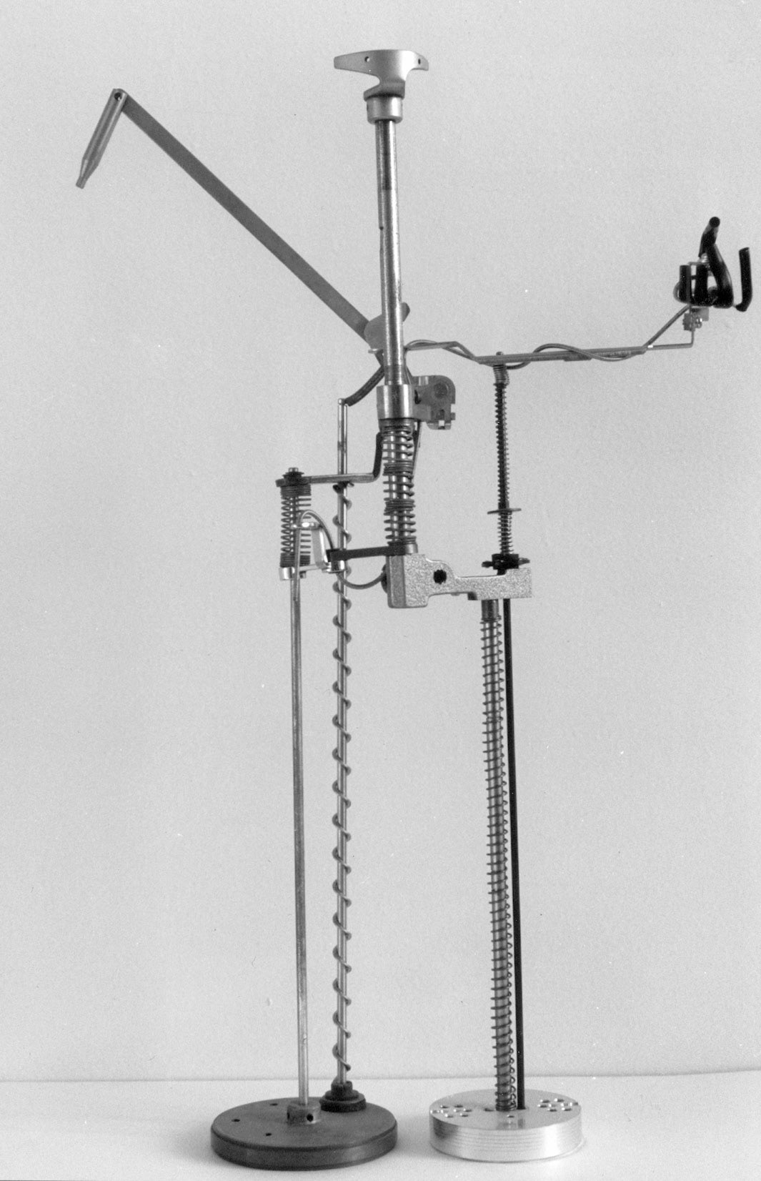
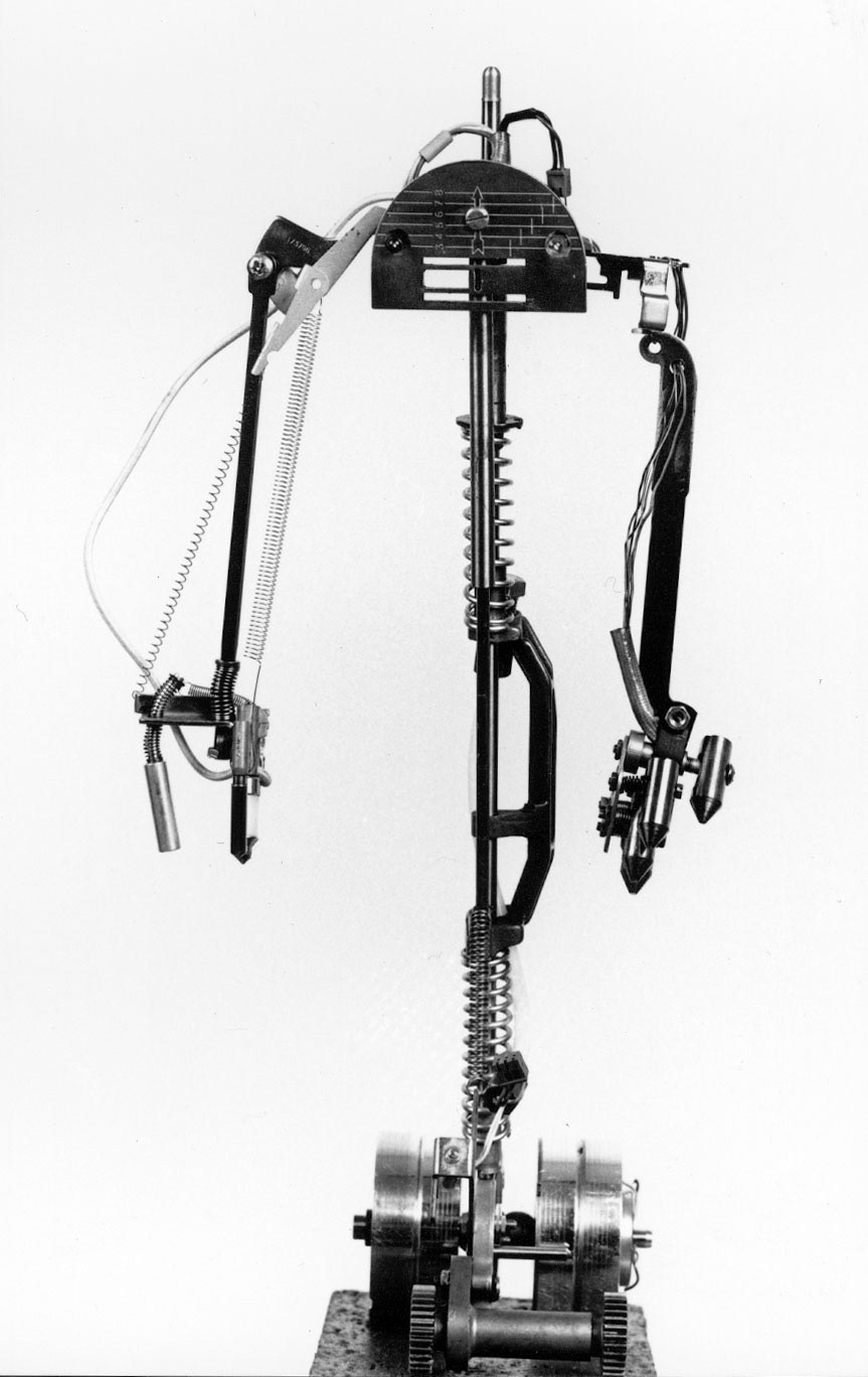
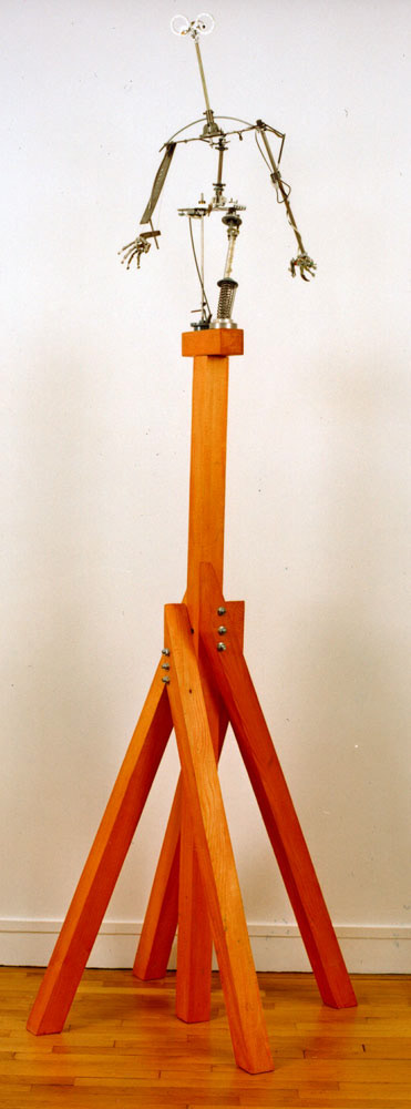
SCULPTURE: GRAND ROBOT
1993, metals and plastics with wooden stand, 39 x 18 x 24 cm + 179 x 85 x 85 cm

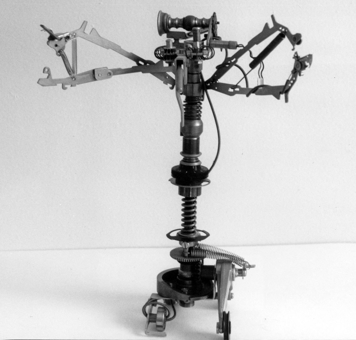
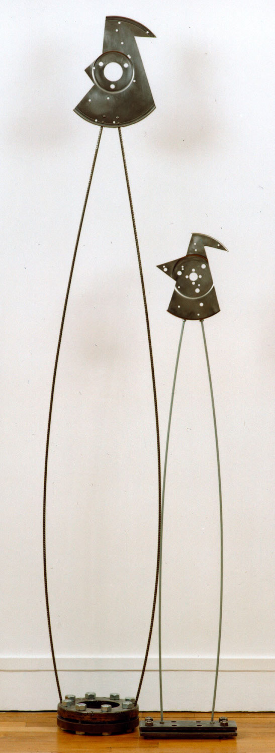
SCULPTURE: 27 SEPTEMBRE #1, #2, #3
1992, 1993, metals, 122 x 24 x8 cm, 173 x 28 x20 cm 258 x 53 x 43 cm
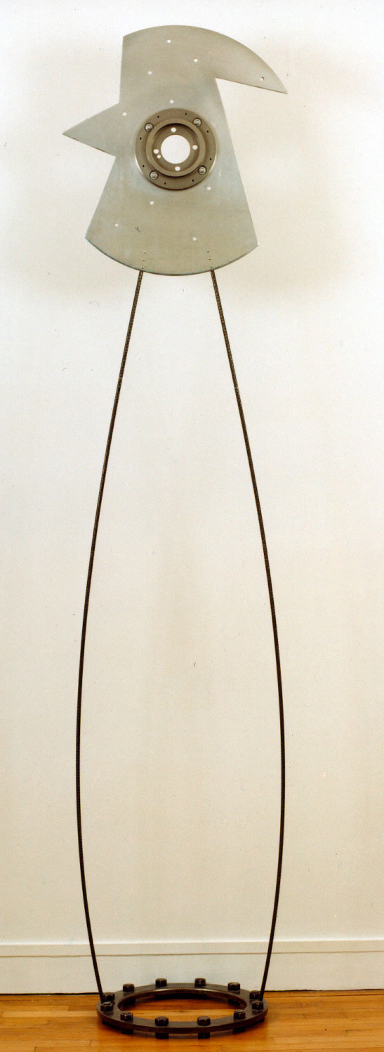
Robots are made from mechanical pieces scavenged from old mechanical and electronical devices. Nothing is ever soldered, I only use nuts and bolts.
The "27 septembre" sculptures also use scavenged materials for the footer and the head, while the "legs" are made of bent steel rods.
Les robots sont construits à partir de pièces métalliques et plastiques de récupération, en utilisant uniquement le vissage comme technique d'assemblage.
Les « 27 septembre » utilisent des socles et des têtes également récupérés, et de frêles tiges filetées ou des fers à béton mis en tension en guise dejambes.